From feedback to features: How your input helped evolve the candidate profile

Earlier this year, we introduced the new candidate profile in Greenhouse, along with a promise: we’d carefully listen to your (our customers’) feedback. Since then, we’ve been hard at work iterating based on your insights to refine and improve the candidate profile. Your invaluable guidance has helped us prioritize what matters most, and we’re thrilled to share some of the meaningful updates.
While we’ve launched ongoing enhancements, we most recently released several improvements that address the themes and challenges we heard most often. Let’s explore how your input has shaped the evolution of the candidate profile.
Iterating together: Key enhancements
All jobs: Creating a seamless workflow
Some recruiters shared that we added an extra click to access relevant job details. For this reason, we updated the “All jobs & applications” section in Greenhouse to keep everything within the same tab and display more comprehensive details, like documents from previous applications. This ensures you can stay focused on the application at hand while having all the context you need at your fingertips.

Accordion view for stages: A familiar and improved view
In our initial research, we learned that hiring managers felt overwhelmed by the amount of information at first glance. We wanted to add more clarity into their day-to-day tasks. This led us to explore a more streamlined and simpler view of each stage.
However, your feedback helped us realize that while we simplified the core area of the candidate profile, recruiters (our power users) really needed a more scannable and holistic view of the stages. Based on your input, we brought back the accordion view, which allows for multiple stage details to be viewed simultaneously. We also added more visibility to candidate availability, ensuring critical information is always easy to find.

Streamlined header actions: Always accessible
You love having quick access to key actions like Move stage, Reject, and Mark as hired. However, these were hidden within each stage. By moving these to the header, we’ve made them more accessible, saving you time and clicks. Along with this change, we converted some of the existing header buttons to icon-based buttons to optimize the header’s design for smaller screens.

Supporting diverse workflows
Tasks: Flexibility for every user
Tasks play a different role depending on your workflows. Some users rely on them for guidance, while some need them less prominent. To better accommodate these scenarios, we’ve relocated tasks to the right panel, allowing for a more tailored experience. Whether you want to focus on the main panel or have tasks guide your next steps, the choice is yours. A counter will always show the number of remaining tasks for the current stage, so you’ll always be in the loop.

Notes: Easier to organize and highlight
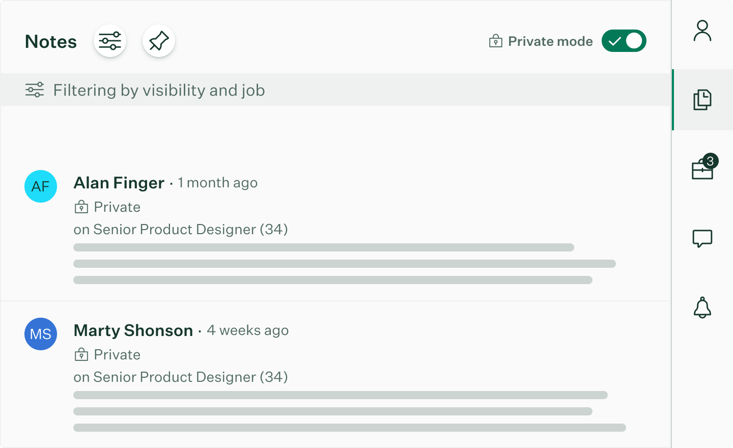
Notes are a crucial tool for many of our users, and we’re excited to introduce updates that make them even more effective. With new filters (like visibility, created by, and job) and the ability to pin notes, it’s now easier than ever to surface the information that matters most. Pinned notes are visually distinct from regular notes for prominence and can also be filtered, ensuring your team always has quick access to critical details.

Keeping privacy top of mind
With the removal of a dedicated private tab, your feedback highlighted the importance of balancing accessibility and privacy. To enhance control, we introduced a toggle that temporarily obscures private information in the right panel. This provides peace of mind, especially in situations like screen-sharing, while maintaining the streamlined design of the candidate profile.

Empowering efficiency
We’re always looking for ways to help you work smarter and faster. With your input, we’ve introduced keyboard shortcuts for common actions, like navigating the right panel or rejecting a candidate. These shortcuts are designed to save time and make your workflow more seamless.

Looking ahead
What we love most about these updates is that they’re a direct result of our collaboration with you. Your feedback has been essential in iterating on the candidate profile so that it works better for everyone.
As we look ahead, we’re committed to continuing to listen and keep you informed about future updates, including the eventual sunset of the legacy experience. We’ll provide plenty of notice, both in and outside the app, to ensure a smooth transition. Looking to 2025 and beyond, we’re excited to build on this foundation with even more features inspired by your needs.
Thank you for being part of this journey – we can’t wait to hear what you think of these latest updates!
If you’re ready to elevate your hiring and simplify your process with the candidate profile, learn more from this Greenhouse Support article.

